Standard Colors
With more standard colors than ever before, This improved standard color collection shows you all of our colors and tells you about them. Note that the colors of the actual finished sign will vary from the colors shown on your screen. Inks are translucent so when printing on a background other than white, the colors will look darker. If you don't see a color you need, we can mix special colors for many items using the Pantone® Matching System.
Black
Black on white or yellow is the best combination for readability.
Black on white or yellow is the best combination for readability.
Dark Gray
A pretty good color for readability. Underused.
A pretty good color for readability. Underused.
Medium Gray
Good for accent colors or shadows.
Good for accent colors or shadows.
Light Gray
While too light for lettering color, it does make a good background or accent.
While too light for lettering color, it does make a good background or accent.
White
Only in very rare cases does white need to be added as an imprint color. The background material serves as the white.
Only in very rare cases does white need to be added as an imprint color. The background material serves as the white.
Twilight Blue
A fantastic choice for readability. The darkest navy.
A fantastic choice for readability. The darkest navy.
Navy Blue
A fantastic choice for readability.
A fantastic choice for readability.
Royal Blue
The most popular blue. A good compromise between readability and eye-catching.
The most popular blue. A good compromise between readability and eye-catching.
Medium Blue
A fair color for readability or accent
A fair color for readability or accent
Sky Blue
Works best as an accent or highlight color but can also be used as main color.
Works best as an accent or highlight color but can also be used as main color.
Olympic Blue
Works best as an accent or highlight color but can also be used as main color.
Works best as an accent or highlight color but can also be used as main color.
Ice Blue
Works best as an accent or highlight color but can also be used as main color.
Works best as an accent or highlight color but can also be used as main color.
Powder Blue
Good for accent colors or shadows.
Good for accent colors or shadows.
Caribbean Blue
An underused, good color for readability.
An underused, good color for readability.
Teal Blue
An underused, good color for readability.
An underused, good color for readability.
Turquoise Green
An underused, good color for readability.
An underused, good color for readability.
Bottle Green
A fantastic choice for readability.The darkest green.
A fantastic choice for readability.The darkest green.
Forest Green
Very good for readability but may blend in with surrounding landscape.
Very good for readability but may blend in with surrounding landscape.
Emerald Green
This is our most popular shade of green. It's not the best for readability but not the worst.
This is our most popular shade of green. It's not the best for readability but not the worst.
Spearmint
A medium-light shade of green. It's not the best for readability but not the worst.
A medium-light shade of green. It's not the best for readability but not the worst.
Spring Green
Used mostly as a second color for accents or highlights.
Used mostly as a second color for accents or highlights.
Lime Green
Should be used only as a background, highlight or accent color.
Should be used only as a background, highlight or accent color.
Minty Green
This is a pastel green and should only be used as a background, highlight or accent color.
This is a pastel green and should only be used as a background, highlight or accent color.
Coffee Brown
A fantastic choice for readability.The darkest brown.
A fantastic choice for readability.The darkest brown.
Rustic Brown
This is our most popular shade of brown. Excellent for readability.
This is our most popular shade of brown. Excellent for readability.
Burgundy Wine
A very good color for readability.
A very good color for readability.
Maroon
This is the popular choice for a dark red. Excellent for readability.
This is the popular choice for a dark red. Excellent for readability.
Cardinal Red
Cardinal Red is a dark red or light maroon. Very good choice for readability.
Cardinal Red is a dark red or light maroon. Very good choice for readability.
Flame Red
Our most popular red. Flame red isn't the best for readability, but it definitely does catch the eye.
Our most popular red. Flame red isn't the best for readability, but it definitely does catch the eye.
Tomato Red
Just a tad lighter and a bit more tomatoey.
Just a tad lighter and a bit more tomatoey.
Terra Cotta
A decent, underused color for good readability. This is dark orange-red.
A decent, underused color for good readability. This is dark orange-red.
Pumpkin Orange
Works best as an accent or highlight color but can also be used as main color.
Works best as an accent or highlight color but can also be used as main color.
Apricot
Apricot is a light yellow-orange and is best as a background, shadow or accent color but can also be used for text.
Apricot is a light yellow-orange and is best as a background, shadow or accent color but can also be used for text.
Dark Yellow
The darkest yellow and is best as a background, shadow or accent color but can also be used for text.
The darkest yellow and is best as a background, shadow or accent color but can also be used for text.
Goldenrod
A golden color that can be used for text, accent or background although not the most contrasting.
A golden color that can be used for text, accent or background although not the most contrasting.
Amber
A golden color that can be used for text, accent or background although not the most contrasting.
A golden color that can be used for text, accent or background although not the most contrasting.
Lemon Yellow
Used as a bright background, highlight or accent color but can be used for text provided there is a contrasting color to go with it.
Used as a bright background, highlight or accent color but can be used for text provided there is a contrasting color to go with it.
Plum
A fantastic choice for readability.The darkest purple.
A fantastic choice for readability.The darkest purple.
Royal Purple
This is our most popular purple and quite good for readability.
This is our most popular purple and quite good for readability.
Lavender
For when a brighter purple is needed but still good for readability.
For when a brighter purple is needed but still good for readability.
Violet
Used mostly as a highlight or accent color but can be used for text. So-so for readability.
Used mostly as a highlight or accent color but can be used for text. So-so for readability.
Lilac
Used mostly as a highlight or accent color but can be used for a light shade of text. This is a pastel purple.
Used mostly as a highlight or accent color but can be used for a light shade of text. This is a pastel purple.
Blossom
As one of the darker pinks, it's a bit better for readability but it's not quite as electric for getting attention.
As one of the darker pinks, it's a bit better for readability but it's not quite as electric for getting attention.
Magenta
Used mostly as a very bright background or highlight color but can be used for text. So-so for readability by itself.
Used mostly as a very bright background or highlight color but can be used for text. So-so for readability by itself.
Fuscia
Our most popular hot pink. It can be used for text with lower readability. It's best for background, accent or highlight.
Our most popular hot pink. It can be used for text with lower readability. It's best for background, accent or highlight.
Pink
Used mostly as a background, highlight or accent color. Not recommended as a standalone text color for readability.
Used mostly as a background, highlight or accent color. Not recommended as a standalone text color for readability.
Khaki
One of our newer colors for background, shadowing or accent. Not recommended as a standalone text color for readability.
One of our newer colors for background, shadowing or accent. Not recommended as a standalone text color for readability.
Beige
One of our less common colors for background, shadowing or accent. Not recommended as a standalone text color for readability.
One of our less common colors for background, shadowing or accent. Not recommended as a standalone text color for readability.
Clear UV Gloss
Used only for an even glossier sheen or extra protective layer in rare cases.
Used only for an even glossier sheen or extra protective layer in rare cases.
Surprise
Mystery Color
Don't know what color you want and don't care? You can leave it to us to pick one for you. This usually speeds up production but the color isn't always something we can duplicate on a reorder. Whatever random color we choose, it will be easy to read.
Don't know what color you want and don't care? You can leave it to us to pick one for you. This usually speeds up production but the color isn't always something we can duplicate on a reorder. Whatever random color we choose, it will be easy to read.
????
|
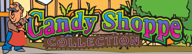
The
new Candy Shoppe Collection is an exclusive
range of colors found only at Rocket Signs.
These colors are specially formulated to be
brighter and more opaque. Increased opacity helps
when keeping the colors accurate when printing on
a darker background.
|
Cherry Cola
A good color for readability, background or accent.
Cocoa
A good color for readability, background or accent.
Grape
A good color for readability, background or accent.
Blueberry
A fair color for readability, background or accent.
Radioactive Slime
Used as a bright background, highlight or accent color but can be used for text provided there is a contrasting color to go with it.
Strawberry
A good color for readability, background or accent.
Bubblegum
Bubblegum can be used for text with lower readability. It's best for background, accent or highlight.
Orange Squeeze
Used mostly as a highlight or accent color but can be used for text with lower readability.
Cheddar
Used mostly as a highlight or accent color but can be used for text with lower readability.
Atomic Yellow
Used mostly as a highlight or accent color. Can only be used for text with a contrasting background. |
This color chart opened in a new window.